
%20(14).avif)
The latest UX design trends — including AI integration, immersive 3D interfaces, animations, accessibility-first design, and bold visual styles like minimalism, brutalism, and collage — are helping brands create digital products that are more personalized, intuitive, and engaging. By adopting these approaches, companies can improve trust, usability, and long-term customer loyalty.
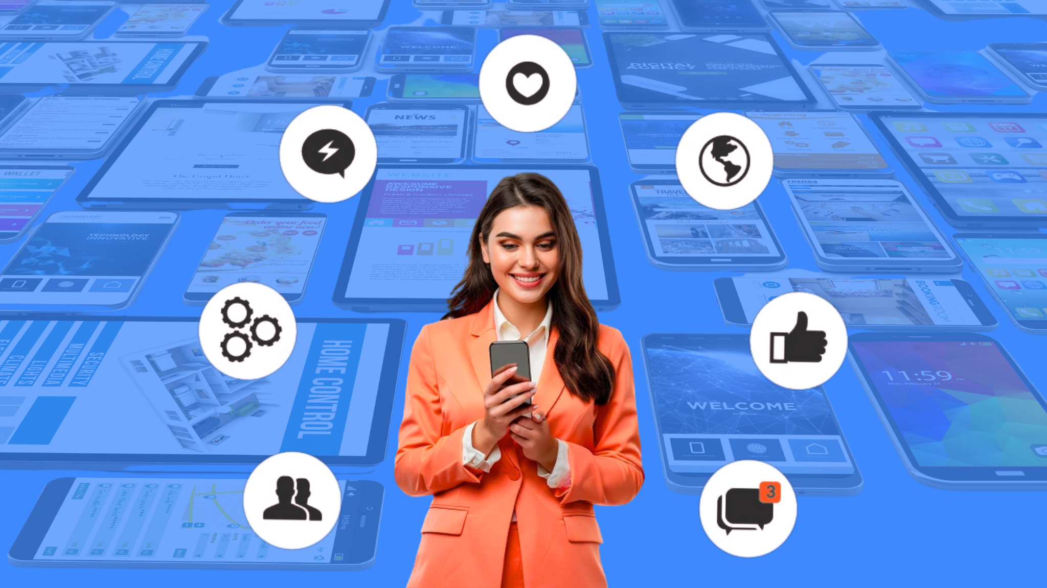
Today, a truly successful product has to do more than just work. It has to adapt to user needs, inspire delight, and feel seamless on any platform or device. This is called user engagement strategy.
If you’re looking to improve your user engagement strategy, six current design trends can help:
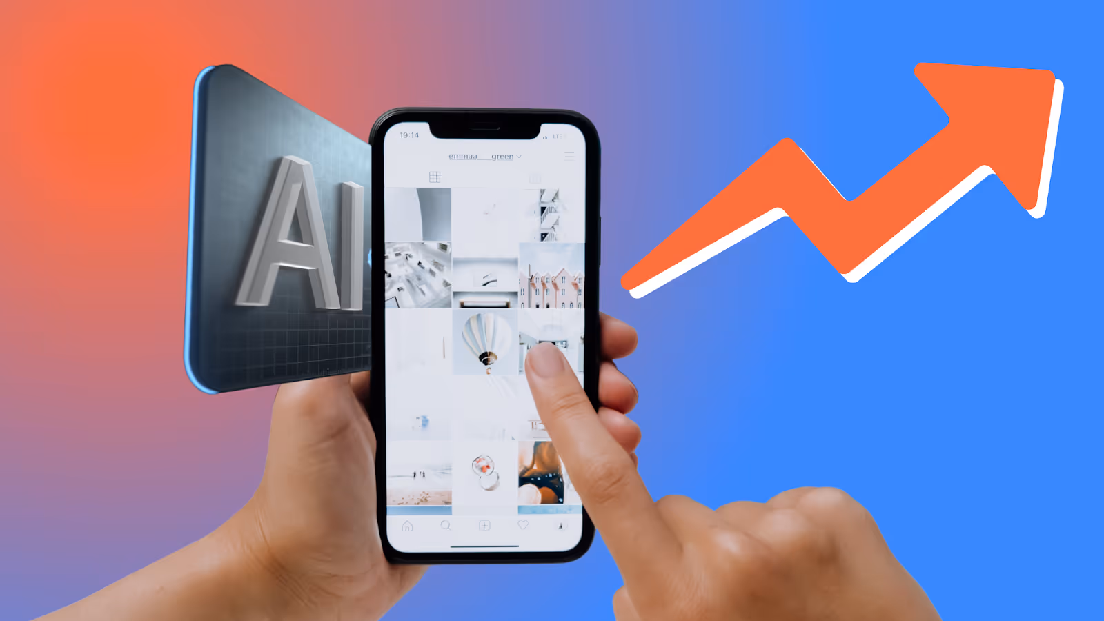
AI is becoming a co-creator in design, helping teams analyze behavior, generate layouts, and automate repetitive tasks. More importantly, it allows interfaces to adjust in real time to each user.
For example, AI tools like V0 and Canva Magic Design can speed up prototyping, creating high-fidelity iterations and variations in seconds, while tools like UIzard and Figma AI accelerate wireframe creation. Automated accessibility testing, through tools like Stark, improves UX before product launch, delivering a seamless experience from day one.
When it comes to apps, webpages, and other digital media, AI can adjust interfaces in real time for each user. AI-powered interfaces change dynamically depending on things like screen size, device type, and user preferences.
Part of this involves placing frequently used buttons or features higher up in the design, as well as adjusting an interface for better accessibility. But it can also include personalized content. For instance, Netflix adjusts movie recommendations in real time based on watched or clicked-on content, while Spotify curates personalized playlists based on a user’s listening trends.
AI is evolving beyond automation to become an active partner in the creative process. These tools can suggest ideas, generate alternatives, and even assist with prototypes, while still leaving room for human creativity and empathy.
Tools like Canva’s Magic Design can instantly generate multiple design variations, giving teams a head start on creative exploration. Similarly, Runway ML and Adobe Firefly expand possibilities by producing visuals, videos, and audio assets that designers can adapt and refine.
By combining AI’s generative power with human vision, design teams can accelerate workflows while keeping the final product grounded in user needs.
A button that changes color when clicked, an icon that shakes when it’s ready to be moved—animations and micro-interactions may be small details, but they bring digital products to life. From ripples to page transitions, these motions achieve more than simply adding personality. They guide users through tasks, confirm the success of a certain action, keep users engaged for longer, and make navigation smoother and more intuitive.
For example, Duolingo uses playful micro-animations to confirm correct answers and reward progress, while Medium adds subtle scrolling animations to give readers a smoother experience. Although “doom scrolling” has been criticized, it’s a sure sign that your app is engaging. For a case in point, take Instagram: the app’s smooth transitions keep users on the platform for hours at a time.
Of course, animations and micro-interactions also play a vital role in brand identity, adding that extra touch of personality that makes a brand or product truly stand out. (See Nielsen Norman Group’s article on microinteractions for more on how these small details improve UX.) For an example, look no further than like button animations on social media platforms like Facebook and Instagram.
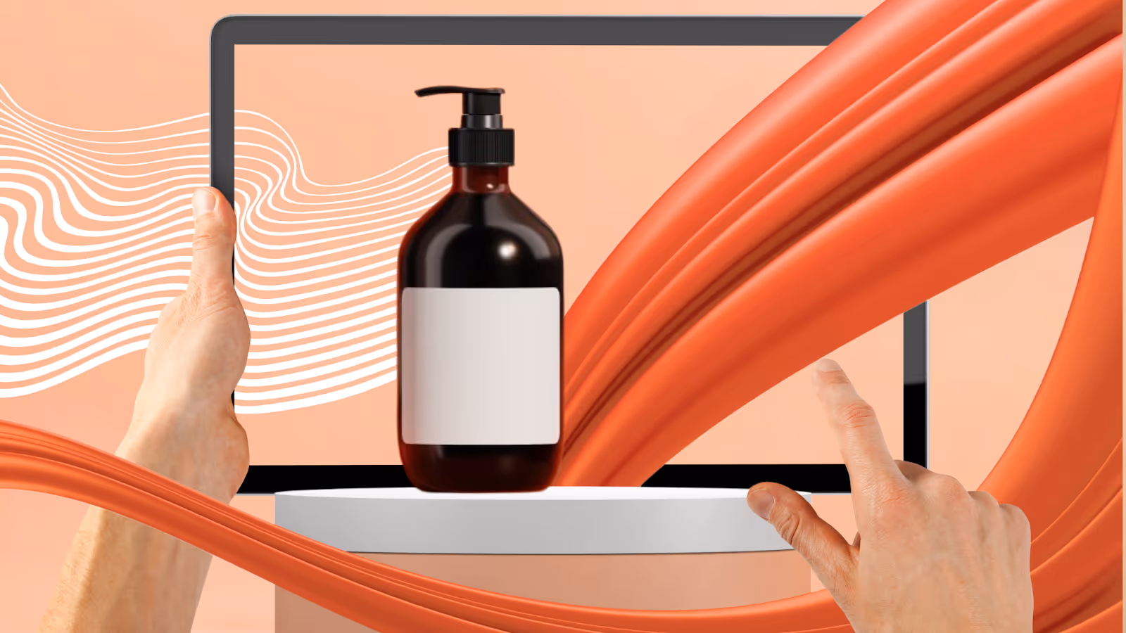
Gone are the days of static screens. With AR (augmented reality), VR (virtual reality), and 3D user interfaces, users can explore products and environments in radical new ways. From interactive tours to virtual shopping that lets you closely examine items without being present, these experiences bring a new level of depth and realism to digital design.
For example, IKEA Place uses AR to give shoppers a preview of how furniture will look in their home, while Nike By You offers 3D shoe customization through realistic 3D product visualization. Immersive technology gives brands a leading edge, creating experiences that connect more deeply with customers.
Accessibility and inclusive design ensure that digital products work for everyone, regardless of ability, platform, or viewing preferences. This can include proper color contrast, scalable fonts, voice input, and multi-language interfaces. Inclusive and accessible designs create fairer, more welcoming experiences—ensuring that no user is left behind.
For example, Apple integrates accessibility features directly into its ecosystem. VoiceOver for screen reading, Magnifier, and Live Captions make iOS and macOS usable for blind, low-vision, and deaf users without requiring extra tools.
YouTube provides auto-captions, support for custom subtitle uploads, and multi-language caption tracks for deaf and hard-of-hearing users, while also offering high-contrast modes and keyboard navigation for those with low vision.
When your design is inclusive and accessible, it doesn’t just benefit users with different abilities—it leads to clearer design and easier navigation overall, improving the experience for everyone. (See the WCAG 2.2 guidelines for accessibility standards and Nielsen Norman Group’s accessibility research for best practices.)
Two very different aesthetic directions are shaping modern design: minimalism and brutalism. Minimalism uses clean, whitespace-rich layouts that prioritize clarity and simplicity. For an example, think of the sleek, simple layout that has become Apple’s calling card. Minimalism’s clear, streamlined designs lead to a smoother experience that keeps users engaged.
According to research by Javier Bargas-Avila, Senior UX Researcher at YouTube, users tend to prefer websites that strike a balance between simplicity and familiarity. Clear, low-complexity designs that still feel recognizable make interfaces easier to trust and more engaging to use. (Supported by Google UX research)
Brutalism, on the other hand, embraces raw, bold visuals with high contrast and intentional disruption. A good example is The Outline, which uses bright, contrasting colors and eye-popping displays to stand out from other news outlets. While brutalism can be a turn-off for some users, it works wonders on the right audience, leaving a strong impression that keeps people coming back.
Both styles can be powerful when applied with purpose. Just make sure you consider the pros and cons of each, choose the style that resonates with your brand, and apply other UX design principles to create a seamless, engaging interface.
Similar to minimalism and brutalism, hyperrealism and visual collage are two different styles. Hyperrealism focuses on life-like renderings and hyper-detailed illustrations, while visual collage mixes different styles—like sketches, photography, and calligraphy—into one cohesive story. Together, both approaches bring more depth and richness to digital design, capturing users’ attention for higher engagement.
Adidas Originals often uses collage-style campaigns, creating visually striking content that people can’t help but click on. In 2012, The New York Times ran a multimedia story called “Snow Fall: The Avalanche at Tunnel Creek,” which combined photos, videos, graphics, and narrative into an exciting, interactive experience.
In a world where users are constantly bombarded by content in all its forms—video, visual, text, audio, VR, and more—arresting images and inventive storytelling must become the norm.
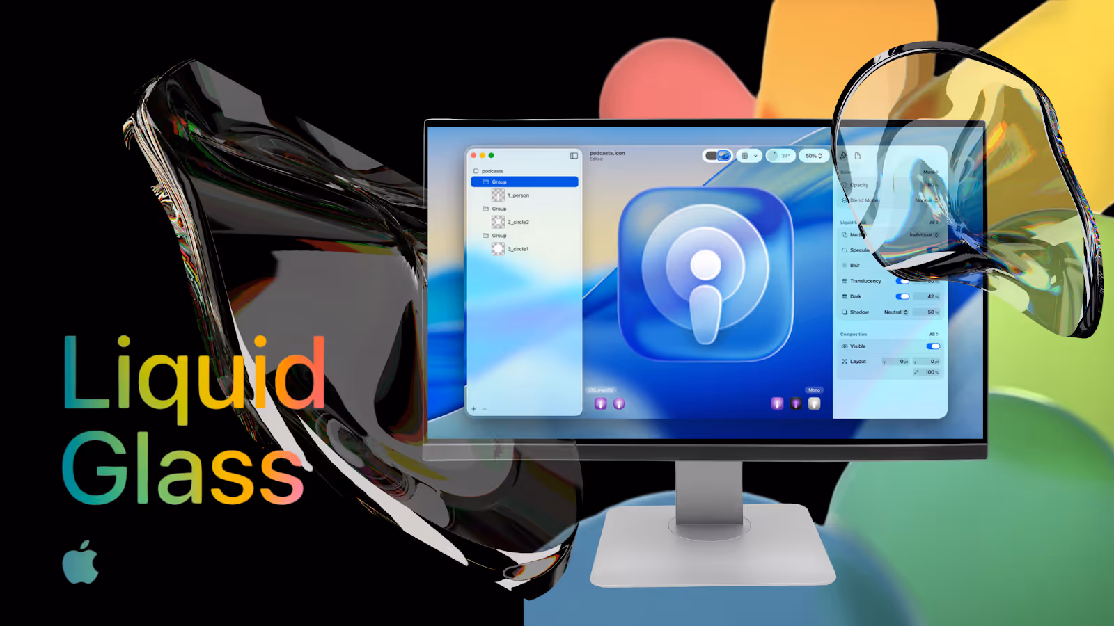
As mentioned already, Apple’s design is instantly recognizable, creating a strong impression when users engage with the brand. It’s also the height of premium, futuristic design. Recently, Apple unveiled a new design language known as “Liquid Glass,” which unifies user interfaces across its suite of products.
Liquid Glass fuses glass-like UI elements with real-time rendering that responds to light and motion. Transparent digital elements contrast with their shape’s outer highlights and automatically adapt to their surroundings by reflecting and refracting light. The result is a fluid, distinctly modern user experience.
Beyond keeping users engaged inside Apple’s ecosystem, this design shift has influenced other companies to adopt similar aesthetics. For example, Microsoft Fluent Design recently introduced translucent “Acrylic Material,” clearly influenced by Apple’s Liquid Glass. Apple’s Liquid Glass—and its impact on the world of UX design—proves that a single innovation can redefine user expectations.
While the trends outlined above can help your brand increase user engagement and stand out from the crowd, that doesn’t mean you need to adopt all of them right this minute. In fact, the best way to approach UX innovation is to:
At Toolbox No. 9, we live and breathe UX/UI design. Our team helps companies translate these emerging trends into real-world solutions that drive engagement. Whether it’s integrating AI-powered personalization or ensuring accessibility and inclusive design, we specialize in making interfaces both beautiful and effective.
If you’re looking for guidance on which trends make sense for your product, our designers can help you prioritize and implement changes that will improve user engagement—with measurable results.
Redefining user engagement isn’t about chasing every trend. It’s about choosing the ones that make your product feel more human, more relevant, and more enjoyable. By thoughtfully embracing new design directions that make sense for your brand or product, you’ll do more than meet user expectations. You’ll set new standards for user experience—and set your brand apart as a disruptor in the world of UX design.


.png)
.avif)
.avif)
We build powerful digital products that support our client's mission and provide their users with the best experience possible. How we can help you today?

